Hello everyone,

We've enabled users with the option to switch between Light and Dark mode (Day and Night mode).

To switch between modes, click the ☀️ or 🌜 icons in the header or directly from your usermenu (avatar icon).


Thank you.

Vladimir stickied the discussion .

Thanks! I love dark mode all the time everywhere. As someone with strong myopia anything that can help my eyes ease the strain is welcomed.

  • Edited

As is, FF's dark mode is much better than Upwork. The background alone makes the site more agreeable to use. That said, I think a softer colour scheme would be much easier on the eyes. Maybe the team would consider easing out the contrast of the overall design in the next iteration...

4 days later

@human Thank you for the feedback! I agree there's room for improvement in the color scheme, and I'll be sure to include some updates in one of the upcoming releases.

6 days later
  • Edited
  • GB

Using the forum in dark mode. It's very welcome.

A couple things I would recommend to change, though:

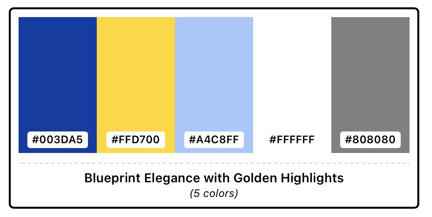
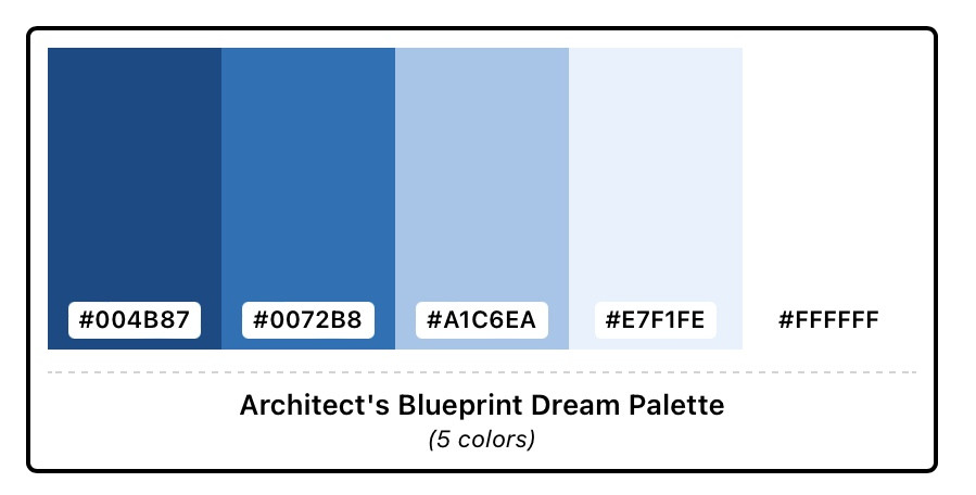
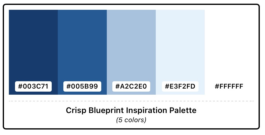
  • Link text is a darkish blue, and I can't read them on the very dark background (background colour is spot on, btw… well, looks a blueprinty dark blue on my ipad, but grey on my mac)
  • Likewise, some of the buttons are a medium blue with what looks like the background colour as text. The background colour as text colour on those buttons is ok if the button colour is lighter.

Here's a couple of suggested colour palettes:


By using Freelancer.Forum, you agree to our Terms of Service and Community Guidelines.